21

I would like to have a simple website that works both on desktop and mobile browser, and encountered a weird (rookie) problem: when I have a table whose column texts are of different length, the font sizes rendered in mobile device are dramatically different. Any idea why this is happening and what is a quick and clean fix? Thanks in advance for your help!

The HTML code:

<!DOCTYPE html>
<html>
  <head>
    <style>
     body {
       font-family: Verdana, Geneva, Arial, sans-serif;
       font-size: medium;
     }
     table, td {
       border: 1px solid black;
     }
    </style>
  </head>
  <body>
    <table>
      <tr>
        <td>Short text. Short text</td>
        <td>Some long text. Some long text. Some long text. Some long text. Some long text. Some long text. Some long text. Some long text. Some long text. Some long text. Some long text. Some long text. Some long text. Some long text. Some long text. Some long text. Some long text. Some long text. </td>
      </tr>
    </table>
  </body>
</html>

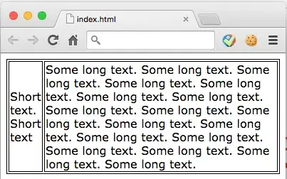
Renders okay on desktop browser

desktop

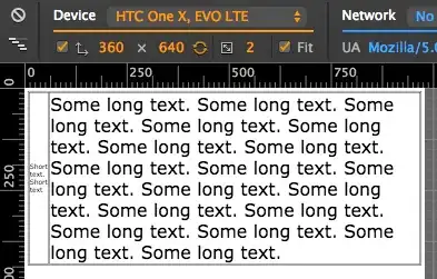
Weird font size on mobile browser (chrome emulator)

mobile

Ying Xiong
  • 4,578
  • 8
  • 33
  • 69
  • What emulator are you referring to? This seems to be a bug in the emulator rather than anything else. – Jukka K. Korpela Nov 22 '14 at 08:25
  • I was using Google Chrome mobile emulator, and nope, it's not a bug --- I saw the same rendering effect on my smart phone (and that's why I set out to fix it). – Ying Xiong Nov 22 '14 at 16:11
  • 1
    You’re correct, this oddity indeed happens in Chrome on Android (and the `meta` tag suggested in an answer fixes this). – Jukka K. Korpela Nov 22 '14 at 18:49

3 Answers3

18

You need to consider setting the viewport of your application. To make a mobile-friendly web application, you will need to set this in your headers. You can do so by adding a <meta> tag between your <head> tags. Here is an example:

<head>
    <meta name="viewport" content="width=device-width, initial-scale=1">
</head>

For a full description of what a viewport is and how it is used, you can visit the article Configuring the Viewport from Apple Developer as it was first introduced for Safari Mobile.

Abel Callejo
  • 13,779
  • 10
  • 69
  • 84
8

Eventually you might also need

text-size-adjust: none;
-webkit-text-size-adjust: none;

to make sure that text is not renderred bigger or smaller depending on the size of table cells. Especially in Safari on iOS I found this to be relevant.

Tom
  • 281
  • 4
  • 7
-1

try this

 body {
  font-family: Verdana, Geneva, Arial, sans-serif;
  font-size: 15px;
}
Artjom B.
  • 61,146
  • 24
  • 125
  • 222
Reza Aria
  • 159
  • 10