How could it be possible use Flex css to leave the elements as follows?
How could it be possible use Flex css to leave the elements as follows?
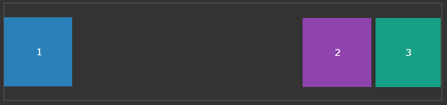
You can use margin-left: auto on second element and that will push second and third element to right.
.content {
  display: flex;
}
.content > div {
  width: 50px;
  height: 50px;
  border: 1px solid black;
}
.content > div:nth-child(2) {
  margin-left: auto;
}
<div class="content">
<div class="box">1</div>
<div class="box">2</div>
<div class="box">3</div>
</div>
You could also achieve this with margin-right: auto on the first element. In this case the main horizontal align is flex-end and only the first div is flex-start. Because of that you can push the first div with margin-right: auto to the left and the others will keep the flex-end alignment. So every additional div will also be positioned to the right side.
#wrapper{
  background: #eee;
  display: flex;
  justify-content: flex-end;
}

.box{
  width: 100px;
  height: 100px;
  background: #000;
}

.box:nth-child(1){
  background: rgba(0,255,0,0.3);
  margin-right: auto;
}

.box:nth-child(2){
  background: rgba(0,0,255,0.3);
}

.box:nth-child(3){
  background: rgba(255,0,255,0.3);
}
<div id="wrapper">
<div class="box"></div>
<div class="box"></div>
<div class="box"></div>
</div>