I'm using flex to create a multi column list that adjusts the number of columns based on the width of the container.
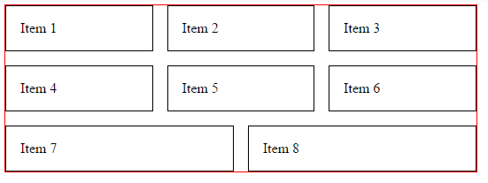
The problem I found is that if I want to use the full width of the parent by setting flex-grow to 1, the items in the last wrapped row are misaligned, since they try to fill the parent.
I found two workarounds that don't work for me: one used media queries, which I can't use because the parent is not the same width of the viewport; the other was using columns, but I can't use it because it causes issues with outlines being cut off and wrapped, which I have in my real setup.
Q: Is there a way to make all items have the same width while filling the parent on full rows?
* {
  box-sizing: border-box;
}

.wrapper {
  border: 1px solid red;
  width: 50%;
}

ul {
  list-style: none;
  margin: 0;
  padding: 0;
  display: flex;
  flex-wrap: wrap;
  margin: -1em -1em 0 0;
}

li {
  border: 1px solid black;
  padding: 1em;
  margin: 1em 1em 0 0;
  flex: 1 1 10em;
}
<div class="wrapper">
<ul>
<li>Item 1</li>
<li>Item 2</li>
<li>Item 3</li>
<li>Item 4</li>
<li>Item 5</li>
<li>Item 6</li>
<li>Item 7</li>
<li>Item 8</li>
</ul>
</div>https://plnkr.co/edit/0u2QxcdLkDfhwV3zASrM
Resize until you get 2 items in the last row.