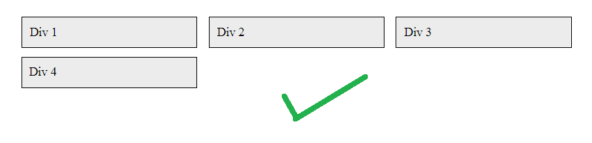
I'm looking for cards that have dynamic width to fill their container, yet be able to wrap if the card gets too small. I got it to do that. Yet I notice that the last card fills up the space that's left. I don't want it to do that. I want it to keep the same column structure. is this possible? I don't have to use flexboxes if there's another way to do it let me know.
.container {
    padding: 20px;
    display : flex;
   flex-flow: row wrap;
   background:white;
}
.container > div {
    border: 1px solid black;
    background: #ececec;
    margin:5px;
    min-width:200px;
    padding: 10px;
    margin-left: 10px;
    flex: 1;
}
<div class="container">
<div>Div 1</div>
<div>Div 2</div>
<div>Div 3</div>
<div>Div 4</div>
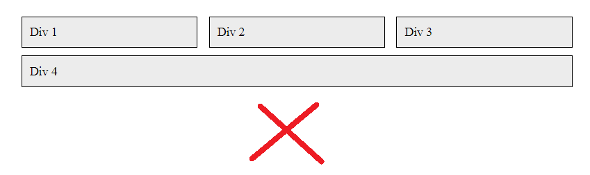
</div>Here's my JSFiddle which is presently doing what the first picture is showing (which is not what I want). Is there a way to do this?