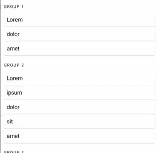
I'd like to have a Compose UI that is something like this (overly-simplified version)...
Each carded list below each group is variable length depending on the list of items fed to the composable. Here's two options for how to approach this (using either a Column or LazyColumn):
@Composable
fun CardedColumn(items: ImmutableList<String>) {
    Card(modifier = Modifier.fillMaxWidth().wrapContentHeight().padding(8.dp)) {
        Column {
            items.forEach { text: String ->
                Text(text = text, modifier = Modifier.padding(8.dp))
                Divider(modifier = Modifier.fillMaxWidth())
            }
        }
    }
}

@OptIn(ExperimentalFoundationApi::class)
@Composable
fun CardedLazyColumn(items: ImmutableList<String>) {
    Card(modifier = Modifier.fillMaxWidth().wrapContentHeight().padding(8.dp).animateContentSize()) {
        LazyColumn {
            items(items = items, key = { it }) { text: String ->
                Text(text = text, modifier = Modifier.padding(8.dp).animateItemPlacement())
                Divider(modifier = Modifier.fillMaxWidth())
            }
        }
    }
}

//================================================================================
// Previews
//================================================================================
@Preview(widthDp = 320, heightDp = 320)
@Composable
fun CardedLazyColumn_Preview() {
    Column {
        val showItems = remember { mutableStateOf(true) }
        Row(
            modifier = Modifier.fillMaxWidth(),
            horizontalArrangement = Arrangement.Center,
            verticalAlignment = Alignment.CenterVertically
        ) {
            Text("Show items: ")
            Switch(checked = showItems.value, onCheckedChange = { showItems.value = it })
        }
        CardedLazyColumn(getItems(showItems.value))
    }
}

@Preview(widthDp = 320, heightDp = 320)
@Composable
fun CardedColumn_Preview() {
    Column {
        val showItems = remember { mutableStateOf(true) }
        Row(
            modifier = Modifier.fillMaxWidth(),
            horizontalArrangement = Arrangement.Center,
            verticalAlignment = Alignment.CenterVertically
        ) {
            Text("Show items: ")
            Switch(checked = showItems.value, onCheckedChange = { showItems.value = it })
        }
        CardedColumn(getItems(showItems.value))
    }
}

//================================================================================
// Helper Functions
//================================================================================
/**
 * Helper function to get more or less items depending upon [showMoreItems] argument
 */
private fun getItems(showMoreItems: Boolean): ImmutableList<String> {
    return if(showMoreItems) {
        persistentListOf("Lorem", "ipsum", "dolor", "sit", "amet")
    } else {
        persistentListOf("Lorem", "dolor", "sit", "amet")
    }
}
If you try both Previews out in either Interactive Mode or in Run Preview, you'll notice that CardedLazyColumn animates the show/hide of new items while CardedColumn does not. This is due to the use of the item key in combination with animateContentItemPlacement, which bakes in the animation. This is why I would prefer to use a LazyColumn.


Therefore, I'd like to create a screen akin to the following...
@Composable
fun MyScreen() {
    Scaffold(topBar = { T23TopAppBar() }) { paddingValues: PaddingValues ->
        Column(
            modifier = Modifier
                .padding(paddingValues)
                .fillMaxSize()
                //I want the full screen to be scrollable in case the content is too large
//                .verticalScroll(rememberScrollState()),
        ) {
            Text(
                text = "Lorem ipsum dolor sit amet",
                style = MaterialTheme.typography.h6,
                modifier = Modifier.padding(8.dp)
            )
            val showItems = remember { mutableStateOf(true) }
            Row(
                modifier = Modifier.fillMaxWidth(),
                horizontalArrangement = Arrangement.Center,
                verticalAlignment = Alignment.CenterVertically
            ) {
                Text("Show items: ")
                Switch(checked = showItems.value, onCheckedChange = { showItems.value = it })
            }
            Text(
                text = "GROUP 1",
                style = MaterialTheme.typography.overline,
                modifier = Modifier.padding(horizontal = 8.dp)
            )
            CardedLazyColumn(getItems(showItems.value))
            Spacer(modifier = Modifier.height(8.dp))
            Text(
                text = "GROUP 2",
                style = MaterialTheme.typography.overline,
                modifier = Modifier.padding(horizontal = 8.dp)
            )
            CardedLazyColumn(persistentListOf("Lorem", "ipsum", "dolor", "sit", "amet"))
            Spacer(modifier = Modifier.height(8.dp))
            Text(
                text = "GROUP 3",
                style = MaterialTheme.typography.overline,
                modifier = Modifier.padding(horizontal = 8.dp)
            )
            CardedLazyColumn(persistentListOf("Lorem", "ipsum", "dolor", "sit", "amet"))
        }
    }
}
But since there may be more items than fit on screen, I'd like the entire screen to be a scrollable Column to handle if there were more items than fit on screen. But as soon as I add .verticalScroll(rememberScrollState()), Compose throws an IllegalStateException ("IllegalStateException: Vertically scrollable component was measured with an infinity maximum height constraints, which is disallowed...").
I understand that "nesting components scrollable in the same direction" is a big "no no". But, I don't even want my LazyColumns to be scrollable. I simply want to have a variable length list that bakes in items + animation capabilities that are not included with a regular Column. And simply setting the LazyColumn's userScrollEnabled to false doesn't prevent the IllegalStateException from being thrown.
Now, my questions are:
- Is there some type of workaround to get this Carded
LazyColumnto work inside a scrollable Column? - If not, is there a feasible way to at least replicate this type of behavior? (For example, using a
Columnbut with animations somehow baked in) - Does it make more sense to just use the regular Carded
Columnand not include animations?
Replacing the outer scrollable Column with a LazyColumn and somehow flattening the items in each card to be items of the LazyColumn is the only thing I can think of. But that seems overly-complicated. For example, first item in the card would need to be a card with rounded top corners but cropped flat at the bottom. Last item in the card would need the opposite, etc.

