7

I'm trying to implement a DateListBarChart function that takes dated data and outputs a bar chart with the same placements as DateListPlot. It's essential that they plot data in the same horizontal position if given the same data, so they can be combined using Show. I am finding it difficult to get the settings for BarSpacing right so that the horizontal range of the plot doesn't change, and the bars stay in essentially the same place.

I have been unable to infer the correct scaling so that BarSpacing->{0.2,0.3} results in 20% of the x-axis length available for that group of bars is taken up with spacing between bars in that group, and 30% as spacing between groups of bars. For technical reasons I am doing this by passing things to RectangleChart. According to the documentation, BarSpacing is treated as absolute units in RectangleChart. Obviously the absolute sizes of the gaps need to be smaller if there are more series, and the bars need to be narrower.

Some examples:

arList = FoldList[0.9 #1 + #2 &, 0.01, RandomReal[NormalDistribution[0, 1], 24]]

{0.01, 0.334557, 2.02709, 1.1878, 1.9009, 3.08604, 2.36652, 3.04111, 
3.32364, 3.22662, 3.12626, 2.59118, 1.69334, 1.21069, 0.23171, 
0.689415, -0.852649, -0.124624, 0.58604, -0.481886, 0.221074, 
-0.300329, 2.36137, 0.427789, -1.47747}

dists = RandomChoice[{3, 4}, Length[arList]]
{4, 4, 4, 3, 4, 3, 4, 3, 4, 4, 3, 4, 4, 3, 4, 4, 4, 4, 3, 4, 3, 3, 3, 3, 3}

Results in:

RectangleChart[Transpose[{dists - 0 - 0/2, arList}], 
 PlotRange -> {{0, 100}, {-2, 4}}, ChartStyle -> EdgeForm[None], 
 Frame -> True, GridLines -> Automatic, BarSpacing -> {0, 0}]

enter image description here

RectangleChart[Transpose[{dists - 0.7 - 0.5/2, arList}], 
 PlotRange -> {{0, 100}, {-2, 4}}, ChartStyle -> EdgeForm[None], 
 Frame -> True, GridLines -> Automatic, BarSpacing -> {0.7, 0.5}]

enter image description here

Notice how the data aren't spanning the same distance along the x-axis as the previous example.

It gets even messier when trying to chart multiple series (the same in this example, for illustration).

RectangleChart[
 Transpose[{{dists - i/2 - j/2, arList}, {dists - i/2 - j/2, 
  arList}}, {2, 3, 1}], PlotRange -> {{0, 180}, {-2, 4}}, 
 ChartStyle -> EdgeForm[None], Frame -> True, Ticks -> None, 
  GridLines -> Automatic, BarSpacing -> {i, j}]

enter image description here

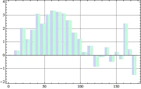
I've been futzing for ages trying to find the right formula so that BarSpacing settings for the custom function (not seen here) induce the correct spacings and bar widths so that the horizontal plot range doesn't change as the BarSpacing does.

What am I missing?

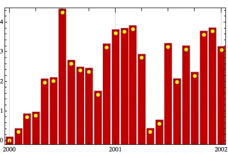
EDIT: In response to belisarius, this is an example of where I am heading. It works, kind of (the bars aren't quite in alignment with the line, but this is probably the dates I am using) but the cases with stacked bars fail to plot with the bars where they should be, as do any kind of bar graph on its own where there are multiple series. (I'm quite proud of the date label placement algorithm: the powers that be at work don't want to give up that look.)

enter image description here

And here is one that just isn't working. The data should fill the horizontal range. (The different width bars are deliberate - it's a combination of annual and quarterly data.)

enter image description here

EDIT 2

I remember why I didn't use Filling in a DateListPlot to draw the bars as in Mike Honeychurch's package - if you have anything other than very skinny bars, they end up having the top edge in the wrong place.

DateListPlot[{dateARList}, 
 PlotStyle -> {AbsolutePointSize[6], Yellow}, Filling -> {1 -> 0}, 
 FillingStyle -> {1 -> {{AbsoluteThickness[12], Darker[Red, 0.25]}}}, 
 PlotRange -> All]

enter image description here

Bo Persson
  • 90,663
  • 31
  • 146
  • 203
Verbeia
  • 4,400
  • 2
  • 23
  • 44
  • I think Mike Honeychurch's `VolumePlot` function may prove useful. You can find the code here: http://library.wolfram.com/infocenter/MathSource/7526/ As far as I can tell, this code seems to be a preliminary version of the new finance visualization plots in v8. Helpful? – telefunkenvf14 Sep 03 '11 at 14:18
  • _Perhaps_ an example (picture) of what you are trying to do with `DateListPlot` (although failed) could help me understand the problem ... – Dr. belisarius Sep 03 '11 at 22:31
  • @belisarius - see if this helps. The organisational graph style is very particular. – Verbeia Sep 03 '11 at 22:53
  • @Verbia, I've had a very similar issue once, using Mathematica 7. The way I solved it was implementing own bar-chart behaviour as needed using the Rectangle[] graphics primitives. There's way too much magic going on with BarChart and related plots, and I ended up giving up on it. After half a days work, I had my solution in a 100-line long function. – Gleno Sep 03 '11 at 22:59
  • @Gleno, that's exactly what I am doing, customising `RectangleChart`. It's more like 30 lines of code than 100, but I still can't get the right formula for spacing the bars correctly relative to the ticks. – Verbeia Sep 03 '11 at 23:35
  • @telefunkenvf14 - see my edit - Mike's solution only works for skinny bars, and won't work at all for irregular-shaped data. – Verbeia Sep 04 '11 at 00:20

2 Answers2

9

Maybe using the ChartElementFunction option instead of BarSpacing helps. For example barplot in the code would plot a bar chart such that each bar has margins of gapl on the left and gapr on the right where gapl and gapr are fractions of the total width of the bar

scale[{{xmin_, xmax_}, {ymin_, ymax_}}, {gapl_, gapr_}] :=
 {{xmin (1 - gapl) + xmax gapl, ymin}, {xmax (1 - gapr) + xmin gapr, ymax}}

barplot[dists_, arList_, {gapl_, gapr_}, opts___] := 
 RectangleChart[Transpose[{dists, arList }], opts, 
  Frame -> True, 
  GridLines -> Automatic, BarSpacing -> 0,
  ChartElementFunction -> (Rectangle @@ scale[#, {gapl, gapr}] &)]

Usage:

To plot the original bar chart with no gaps

barplot[dists, arList, {0, 0}]

rectangle chart with no gaps

This would plot a bar chart with a margin of 0.2 on both sides which results in a bar chart with gaps of 0.4 times the total width of the bars. Note that the positions of the bars matches with those in the first figure.

barplot[dists, arList, {0.2, 0.2}]

barchart with gaps

You can plot multiple series by doing something like

Show[barplot[dists, arList 0.9, {0, 0.5}],
 barplot[dists, arList 0.8, {0.5, 0}, ChartStyle -> LightGreen]] 

two series in one plot

rcollyer
  • 10,475
  • 4
  • 48
  • 75
Heike
  • 24,102
  • 2
  • 31
  • 45
  • 1
    +1 That's awesome, Heike - I never thought of `ChartElementFunction`. – Verbeia Sep 04 '11 at 00:35
  • I just confirmed that it works. It turns out that if you scale the widths of the rectangles for the number of series (which I was doing anyway) you don't even need to use `Show`. I pick up the value of the `BarSpacing` option and then use `ChartElementFunction -> (Rectangle @@ barscale[#, {gapfactorwithin/(2 xscaling), gapfactorwithin/(2 xscaling)}] &)`, while setting `BarSpacing` back to 0 in the actual `RectangleChart`. Thanks again Heike, that has helped me so much. This is another example when I should stop banging my head against the keyboard and ask the internet sooner :) – Verbeia Sep 04 '11 at 02:25
  • It's a pity we can't weight our votes according to how much time someone has saved us :) – Verbeia Sep 04 '11 at 08:26
  • @Verbeia [`Bounties`](http://stackoverflow.com/faq#bounty) are intended to reward that – Dr. belisarius Sep 04 '11 at 18:13
  • ok, so I looked up the FAQ and I have to wait until tomorrow to set that. – Verbeia Sep 04 '11 at 22:38
  • 4
    I have started a bounty worth the exact difference between my reputation and @Heike 's at the time I started it. I have to wait till tomorrow until I award it. – Verbeia Sep 06 '11 at 07:10
  • @Verbeia, great sportsmanship regarding the retroactive bounty. Heike, this is a fine solution. – Mr.Wizard Oct 17 '11 at 21:09
5

You may relieve your complaint about FillingStyle by using CapForm["Butt"].

list = {0.01, -0.81, 0.12, 0.81, 1.79, 1.1, 0.41, 1., 1.33, 1.08, 
  2.16, 1.13, 1.92, 1.64, 1.31, 1.94, 1.71, 0.91, 2.32, 0.95, 1.29, 
  1.28, 2.97, 4.45, 5.11}

DateListPlot[list, {2000, 8}, 
 PlotStyle -> {AbsolutePointSize[6], Yellow}, Filling -> {1 -> 0}, 
 FillingStyle -> {1 -> {{CapForm["Butt"], AbsoluteThickness[14], 
      Darker[Red, 0.25]}}}, PlotRange -> {0, 6}, ImageSize -> 400]

enter image description here

Mr.Wizard
  • 24,179
  • 5
  • 44
  • 125
  • that is an awesome solution! It isn't suitable for stacked bars and multiple series, unless I do some manipulation of data sets to be cumulative. But it might be a useful option for single line-bar and bar charts given this problem: http://stackoverflow.com/questions/7396898/why-do-barchart-graphics-exported-from-mathematica-have-pixelated-text-is-there – Verbeia Oct 17 '11 at 21:30
  • @Verbeia, I know it's not a complete solution, but I thought it would be helpful, and it is very simple. – Mr.Wizard Oct 18 '11 at 00:26
  • it is, and the use of `CapForm` in a Style option is not well known. That +1 was me. – Verbeia Oct 18 '11 at 00:34